There’s an old farmer’s parable that goes something like this. If you place a donkey equal distant from two delicious looking bales of hay, he’ll starve to death. The reason is he can’t make up his mind which one to eat. Too many choices for the donkey.
Every time I research something online or want to buy something, I have to make choices.
- Where will I most likely find what I’m looking for or what words do I use to search for candidate websites? *type, type, enter*
- That is quite the list Google. Well, let’s start with Bob’s Super Store then. *click*
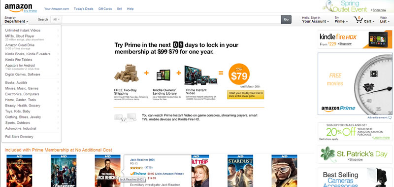
- Wow… that’s a lot of links & text! Where do I find headsets? *scan the menu, the header, the main content area, the sidebar, the footer – ah – let’s use search*
- Maybe it’s under headphones instead…? *looking, clicking, reading, searching, looking…*

Many website owners recognize the value of their homepage. It’s precious real estate and they want to maximize it. What happens is they pack every possible important item onto the home page because, of course, EVERYthing is important. They also want to be sure I see the 15 top level content categories they have. And then there are those that love big attention getting graphics that announce something else that’s important.
White space is your friend but even more important is a narrow selection of choices. 3-5 works best. If you really need to have more, break them up visually. Use white space and/or color (please use a coordinated color scheme). These may seem minor but they can have a big impact. More importantly, I really do want to do business with you and they help me – your customer. When I see too many choices and big attention getters, the site begins to become an impenetrable wall of text and graphics and I feel the urge to click on the back button.
I like simple. I don’t mind clicking to get to what I’m looking for as long as the clicks seem to be taking me in the right direction. How many clicks? It depends upon how big the site is and how many options there are. The organization of your content and navigation become increasingly important the more content and products you have. But that first page I land on needs to make clear a few simple and easy to understand choices or I’m gone. Too many choices will kill the donkey. Don’t be a donkey killer.

